Anda Sposob.
Brand Motion
The Brand
Anda Sposob is a photographer whose work blends elegance with a timeless, nostalgic touch. Her identity reflects that: a hand-drawn A and S monogram with soft, flowing letterforms, warm tones, and refined typography. Personal, elegant, and true to the way she sees.
The Brief
The identity looked right standing still, but it had no way to move. Photography lives in motion now, in scrolling galleries, stories, reels, and client films. The brief was to give the brand a consistent way to behave across all of them, framing her images without ever competing with them.
The Approach
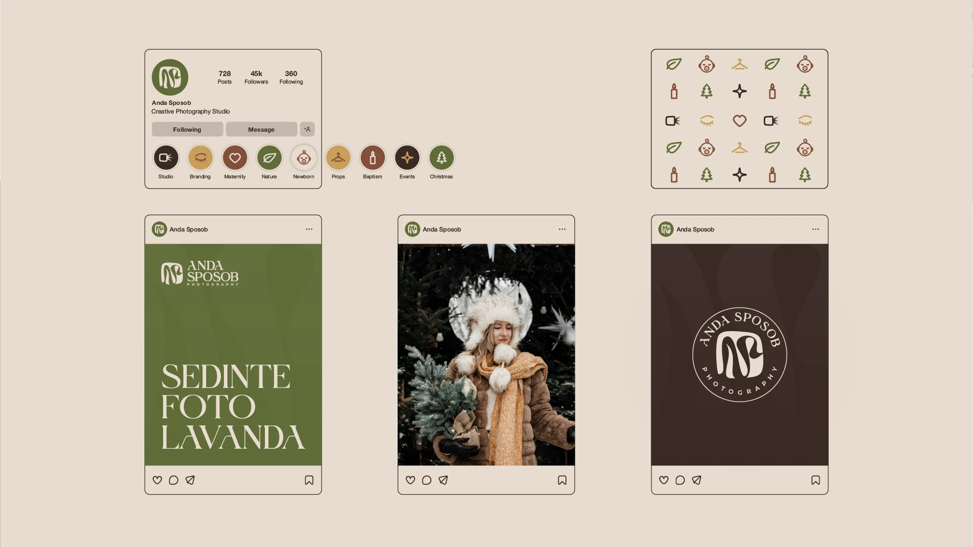
The motion had to breathe the way her photography does. Slow, deliberate easing, soft fades, gentle scaling, nothing that pulls the eye from the image beneath. The hand-drawn monogram shaped the logo animation, its lines drawing themselves on. The same language then carried across every touchpoint she uses.
The Result
A complete motion system Anda can deploy across her work: an animated logo, a soft loading loop, animated highlight icons for her categories, and social templates for stories and posts. Every piece moves with the same slow, gentle rhythm, framing her photography with the same care she brings to every shoot.


